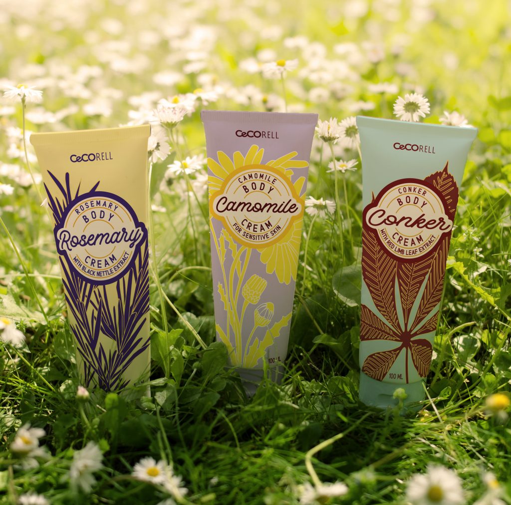
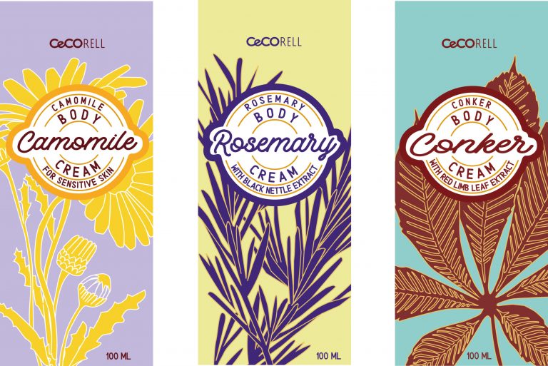
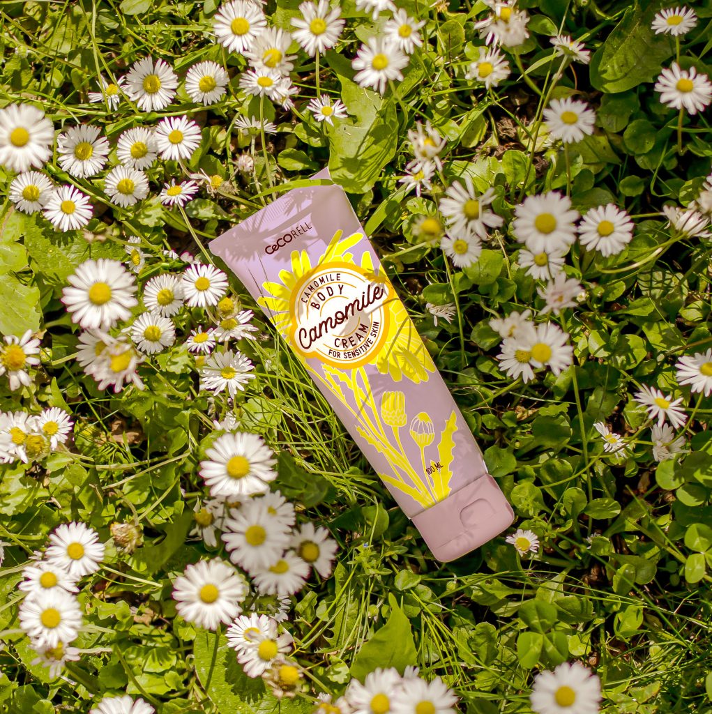
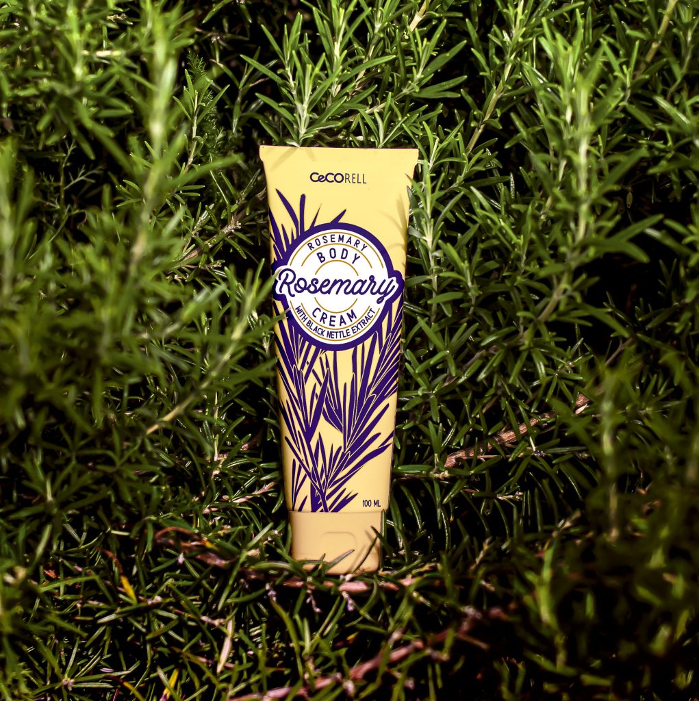
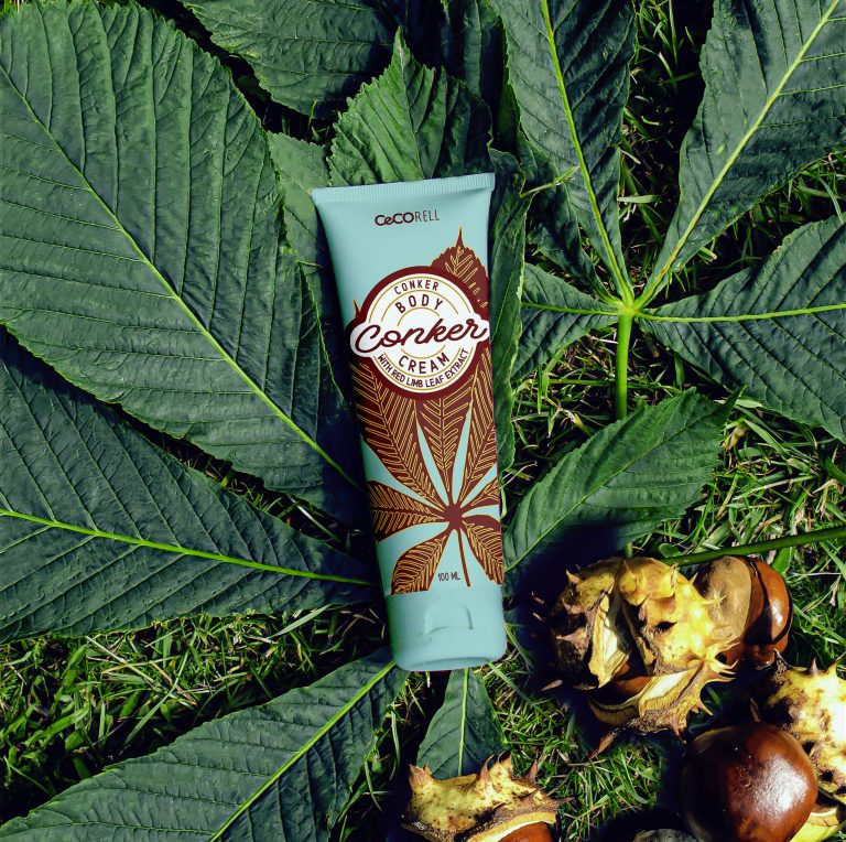
CeCorell logo was created for the need of a new cosmetic brand. The creation of typography expresses the cosmetics industry. Emphasising the round shapes of the logo refers to the cells of the body and reflects the quality of the brand, its fragility in a series of cosmetics as well as a bold expression.
At the time the logo for the series of hand creams were created. The use of logo through hand writing typography with a modern solution as a combination of sans serif typography took place in the upper part of the package. A bold composition with an illustration of herbal ingradients with a combination of soft pastel colours gives a sophisticated visualisation that effectively communicates the quality of the product and its benefits.